[en] The Production Quality Report (QAR) Widget
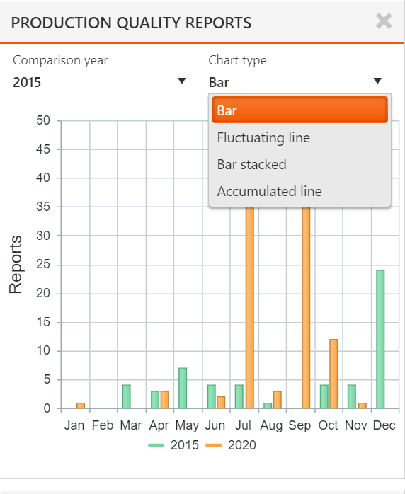
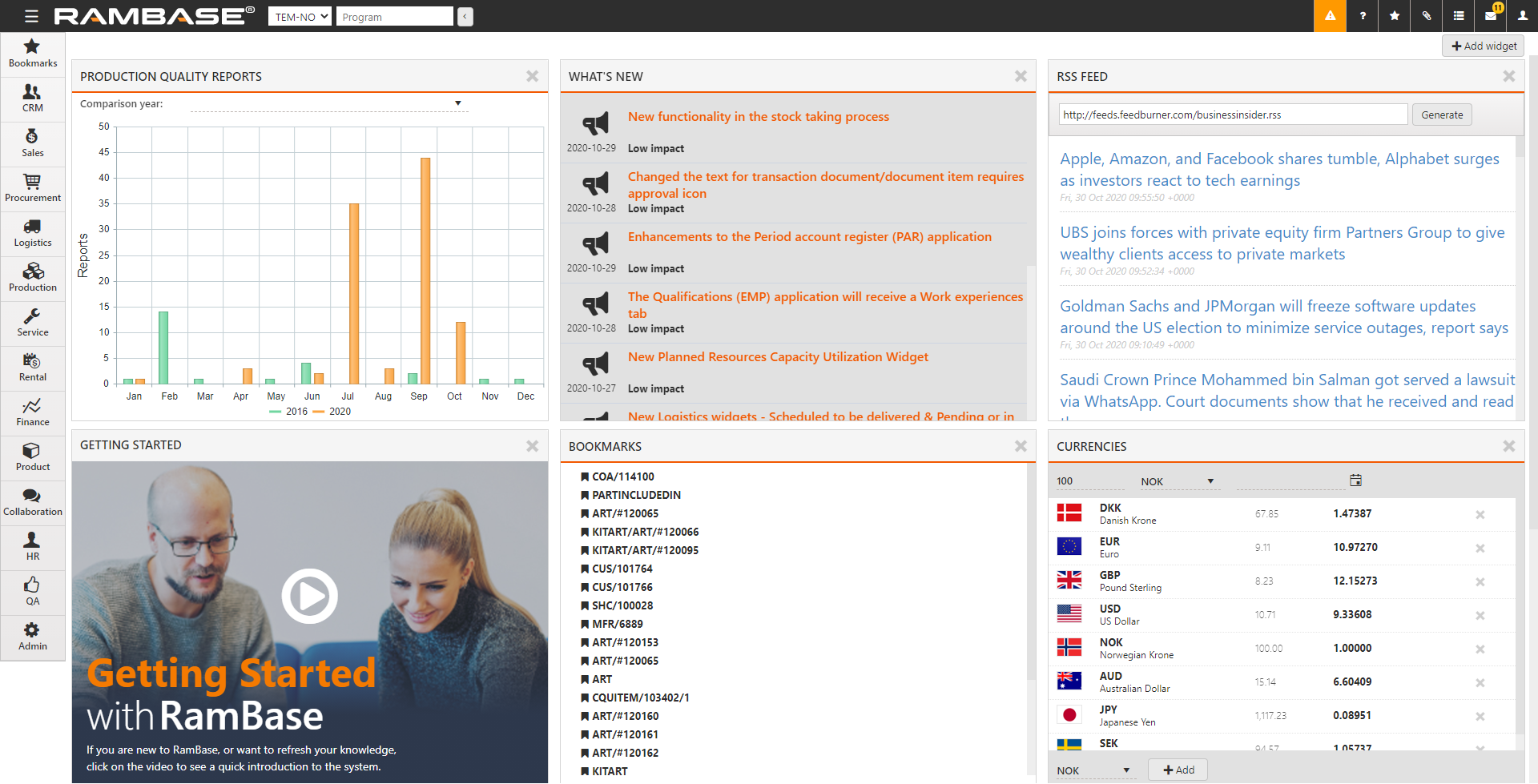
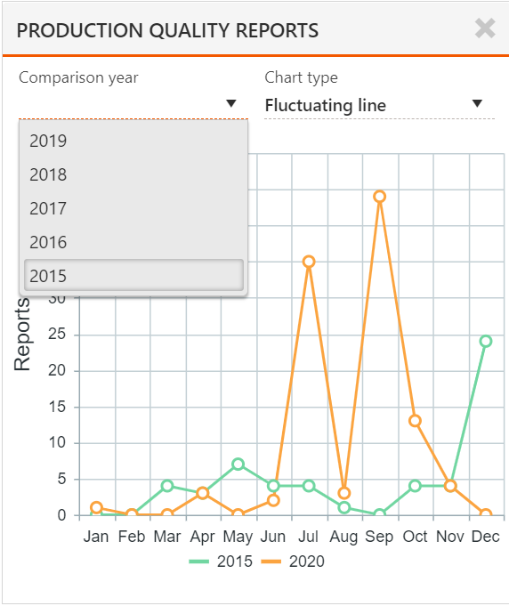
[en] You use the QAR widget to see the number of quality reports related to production, by month. The Y-axis gives the number of reports and the X-axis gives the months from January to December.
[en] To add the QAR widget to your desktop, select
 in the desktop.
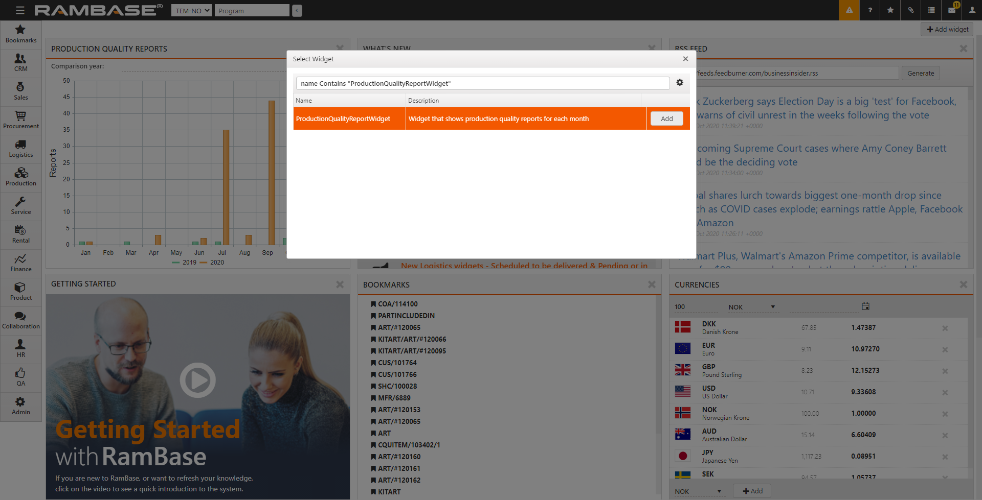
[en] Select ProductionQualityReportWidget and select
 .
.[en] To compare the number of reports in the current year with any year in the past 5 years, select the Comparison year from the list.
[en] Hover over any bar, or the grid in the vicinity of a bar to see the month and number of reports in that month.
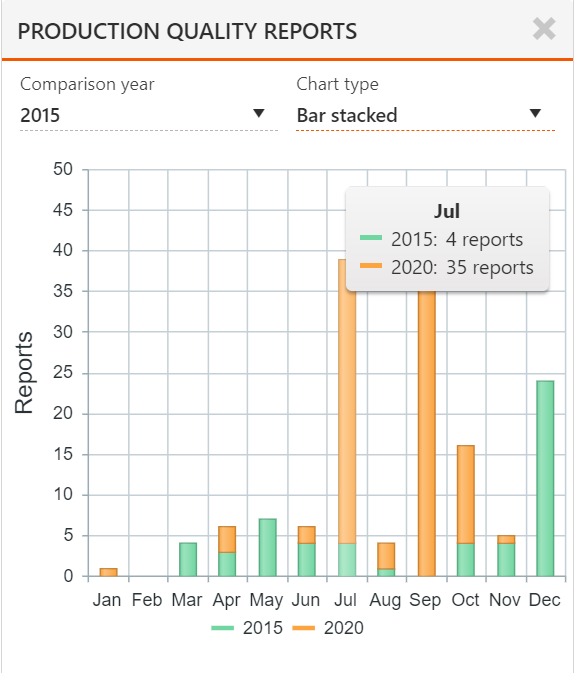
[en] You can view the chart as one of four types by selecting the necessary Chart type in the list.
[en] Bar. This is a typical bar chart that shows the data as color-coded bars.
[en] Fluctuating Line. In this chart, the data is represented by color-coded lines.
[en] Bar Stacked. In this chart, the bars for the comparison and current years are superimposed.
[en] Accumulated line. In this chart the data is represented by color-coded, shaded areas.