[en] The Planned Resources Capacity Utilization Widget
[en] The Planned Resources Capacity Utilization widget shows you the history of utilization of planned resource capacity as a line chart. This widget is useful to get a quick history of the utilization of the planned resources. The Y-axis shows the utilization as a percentage of the total available capacity. The X-axis shows the time interval in months.
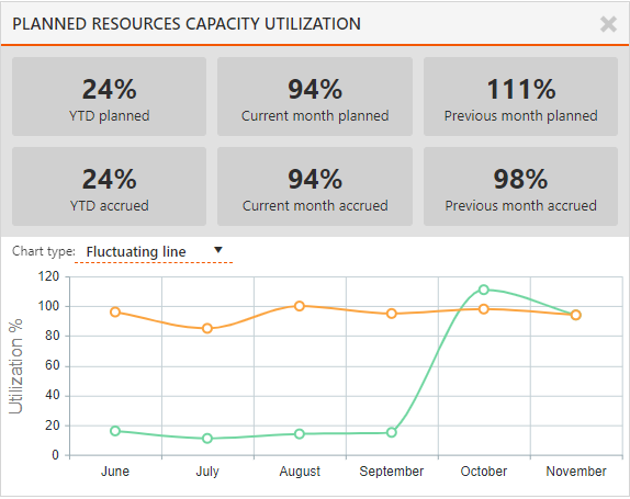
[en] In the gray areas at the top of the widget, the planned and accrued percentage utilization is shown for the Year to Date (YTD), which is from 1st January of the current year to the current date. The planned and accrued percentage utilization is also shown for the current and previous months.
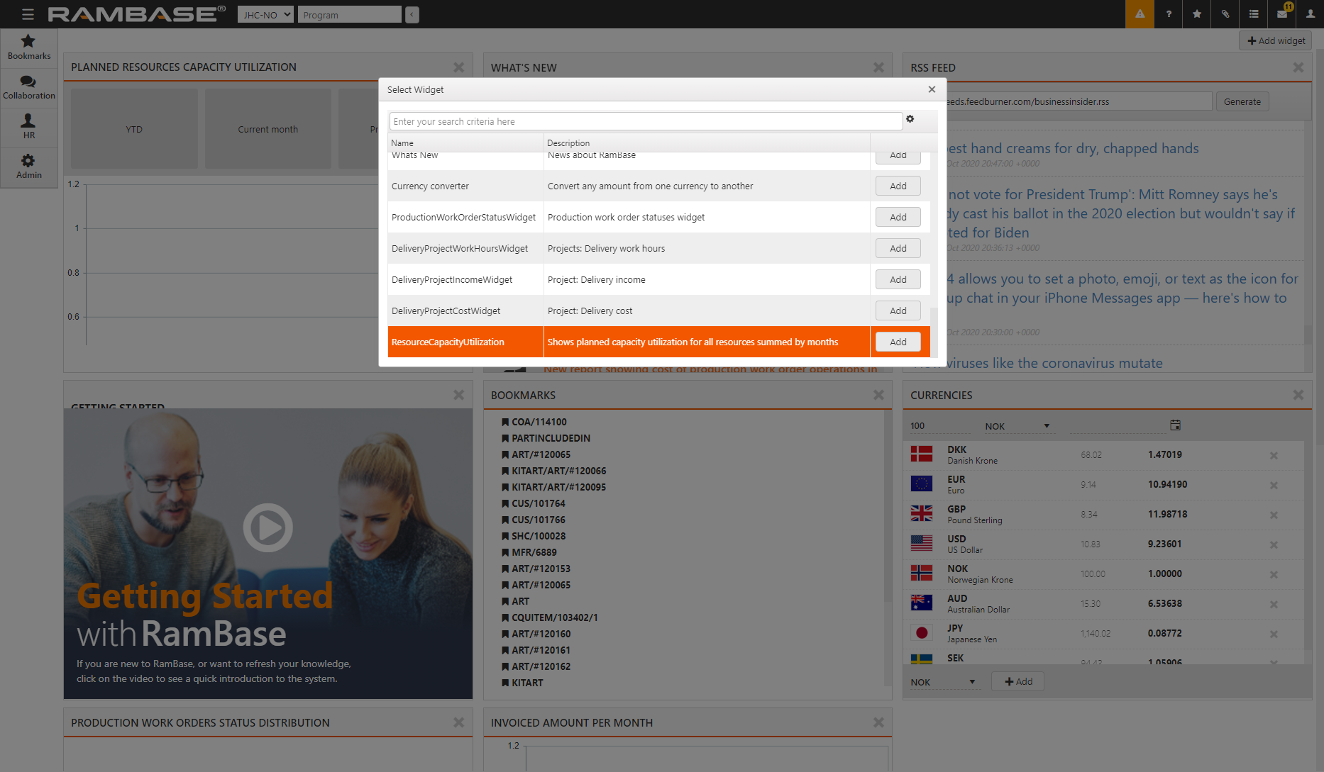
[en] To add the widget to your desktop, select
 in the desktop.
[en] Select ResourceCapacityUtilization and select
 .
.
[en] Select the Chart type to view the chart as either a Fluctuating line, Accumultaed line, or Bar chart.